Step #1 - Start the job - Develop the Raw file in Lightroom
In order to write about a portrait processing session, you first need a good portrait photo, so I asked my friend and colleague Julia Kuzmenko (www.juliakuzmenko.com) to send me one of her excellent portraits and gladly, she agreed. This photo was taken in very warm lighting conditions, so I decided to cool it.
What comes to our mind when we think about landscape photography colors? It's only natural - deep and rich blues, deep and glowing yellows and greens, rich and warm reds and oranges and of course, high contrast yet detailed scenery.
In reality, our "memory color" isn't always what the camera captured...
This photo for example, was taken in Solvang CA (just north of Los Angeles). This is how it looks in Lightroom with the default develop settings:
Doesn't really match the imagined colors... To close to reality :)
Most Lightroom users are accustomed to use presets, so either they select an existing one or they start adjusting the Basic and HSL sliders, trying to get the desired colors.
This method doesn't extract more or different colors from the original Raw file. It adjusts the RGB colors of the developed image. Actually, it is similar to the same actions performed in Photoshop after you open the image.
In order to extract more or different colors from a Raw photo, you need to use profiles, which are accessed via the Camera Calibration tab. Yes I know, it is the last one on the list but should have been the first! In this post you'll see how you can boost colors in just 2 steps...
In this photo I used PSKiss Vivid Landscape Mode 1 profile (part of pskiss Color Profiles):
This specific DNG Profile enhances contrast and for this specific image, it's a bit too dark, so I opened the shadows with Fill Light in the Basic tab:
It is possible to boost you landscape photos' colors in just 2 steps...
Using Profiles vs. Using Presets
Using presets in Lightroom is almost a second nature to many of it's users, whether they download them or create their own. It's a workflow that saves time and effort.
However, presets alter the image AFTER Lightroom (or Photoshop) has rendered the Raw data and created the initial color image. This stage uses by default, one of Adobe's standard profiles. You can see which profile was used for the default rendering in the Camera Calibration tab in both Lightroom and Photoshop ACR window. It will be either Adobe Standard or ACR and a the version number:
For some camera models you can choose a camera standard profile, such as Camera Landscape, Camera Portrait etc. Standard profiles from Adobe contain PERCEPTUAL data which has its limitations.
So, are there any other profiles?
Yes, there are and they are called - PSKiss Color Profiles. These custom made profiles, contain CREATIVE data. This means that the image is already applied with creative adjustments before you ever needed to do anything
Now you can make your personal adjustments with ACR or Lightroom, on top of a creative DNG profile – for faster workflow, better utilization of ACR and Lightroom tools and much more flexibility.
See the advantages of using DNG profiles instead of regular presets:
Here are some samples
Portraits:
Landscape / Scenery:
In this free video tutorial you can learn about the benefits of PSKiss Color Profiles:
Special thanks and hugs to our contributing photographers (in random order...):
An important stage of this project is the overall "look" of the photos.
In digital photography, you can create it on session or with post production in Photoshop. Because we wanted to young dancers to feel free, we decided not to overwhelm them with a lot of photo gear. This made us work with natural light only and shifted the creation of the "look" to the computer.
Let's roll...
In this step-by-step Photoshop tutorial, I will go through the essentials of creating your unique appearance of your photos.
Step #1 - Crop I decided to use a ratio of 4/5. The camera's 2/3 felt to "stretched" this time:
Step #2 - Fix White Balance Pick up the White Balance tool (1) and click in a neutral shadow to neutralize the white balance of the photo (2):
You can monitor the area you click on by checking the RGB values (3). If they are almost equal, it is a neutral area. Once you click on this spot, they will become equal.
Step #3 - Choose the Color Profile This is a very important step. The color profile you choose, determines the way Photoshop (or Lightroom) renders the colors of the image. This is prior to any manipulations you will do further on. In this case I chose the Pentax K200D profile for Canon 40D. This is possible when you use PSKiss Cross Camera Color DNG Profiles. This particular profile is helpful when you need to use as much dynamic range as possible with mild initial contrast and it doesn't increase saturation.
Switch to the Camera Calibration tab:
From the Camera Profile menu (Profile menu if you use Lightroom), choose Pentax K200D (this is available only if you have Cross Camera Color profile pack for your camera):
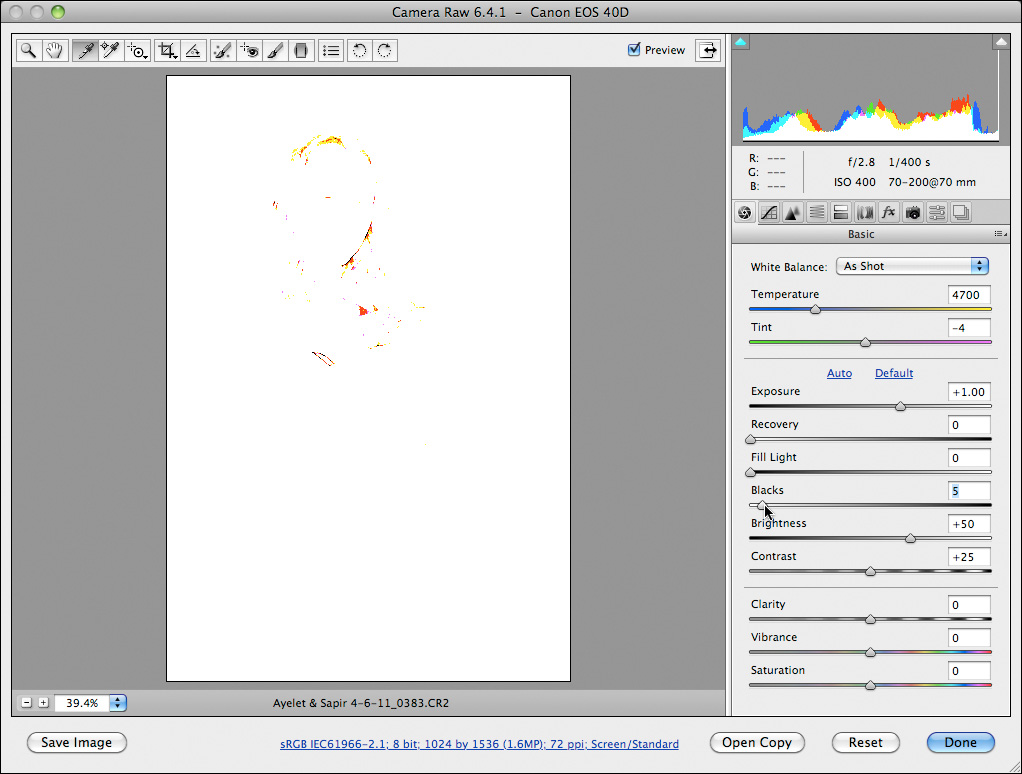
Step #4 - Setup the Basics This might seem a little strange to some of you. Going to the Basic tab in step 4? Yes. No mistake. All the previous steps effect the basics of the image quite dramatically, so I adress them again only after I went through the first 3 steps. Here's a little productive tip about the Basic tab. If you are not sure what to do with the Exposure and the Blacks sliders, hold down the Alt/Option key and click on each one them (one at a time...). This will show you quickly where are the burned out and the totally black areas. This is how it looks when checking the Exposure of this photo:
This shows that only the background is totally burned out so it is perfectly safe to open up the Exposure. I stopped at +1.00 EV:
Now it's time for the Blacks. Hold down the Alt/Option and check the Blacs:
This shows that nothing is totally black. This time I pushed it up to 7. I don't want this image to be too dark in the shadows:
That's it for this one. In many cases I would do more in this tab, but this time is a bit different...
Step #5 - Open as Smart Object
This is one of my favorites workflow techniques in Photoshop because it allows me to go back to ACR when ever I want to. This keeps me working from the Raw data instead of manipulating final pixels. Better quality and much easier to handle. It always remembers what you've done. I love it...
Click on the Workflow Options line at the bottom of the ACR window:
Mark this option in the pop-up window:
Click OK and the click Open Object:
Step #6 - Duplicate the Smart Object
In Photoshop, go to the Layers panel, right-click under the layer's name and duplicate the Smart object using this command (do not duplicate it as if it was a regular layer. It isn't!):
The result:
Step #7 - Create a Tone Map
The final "look" of this image will be created by using a grayscale version of this photo, blended with the colored version.
To create a grayscale version, simply double-click the duplicated Smart Objects (the top layer).
This will open ACR window again. Go to the HSL tab, convert to Grayscale (change the luminosity of the colors until you get the image you want):
To add some "spice" to this look, I switched to the Effects tab, added some Grain and a soft Vignette and clicked OK:
Step #8 - The Final Touch
For the final touch, I changed the blend mode of the B&W layer to Soft Light and lowered the opacity to 60%:
The first color developed image:
The final image:
The Closing Tip
If you want to apply these develop settings to more images (of the same session or any other), simply save the settings of each develop stage:
Don't forget to name it wisely so you will be able to figure out what it does in the future...